RBFCU
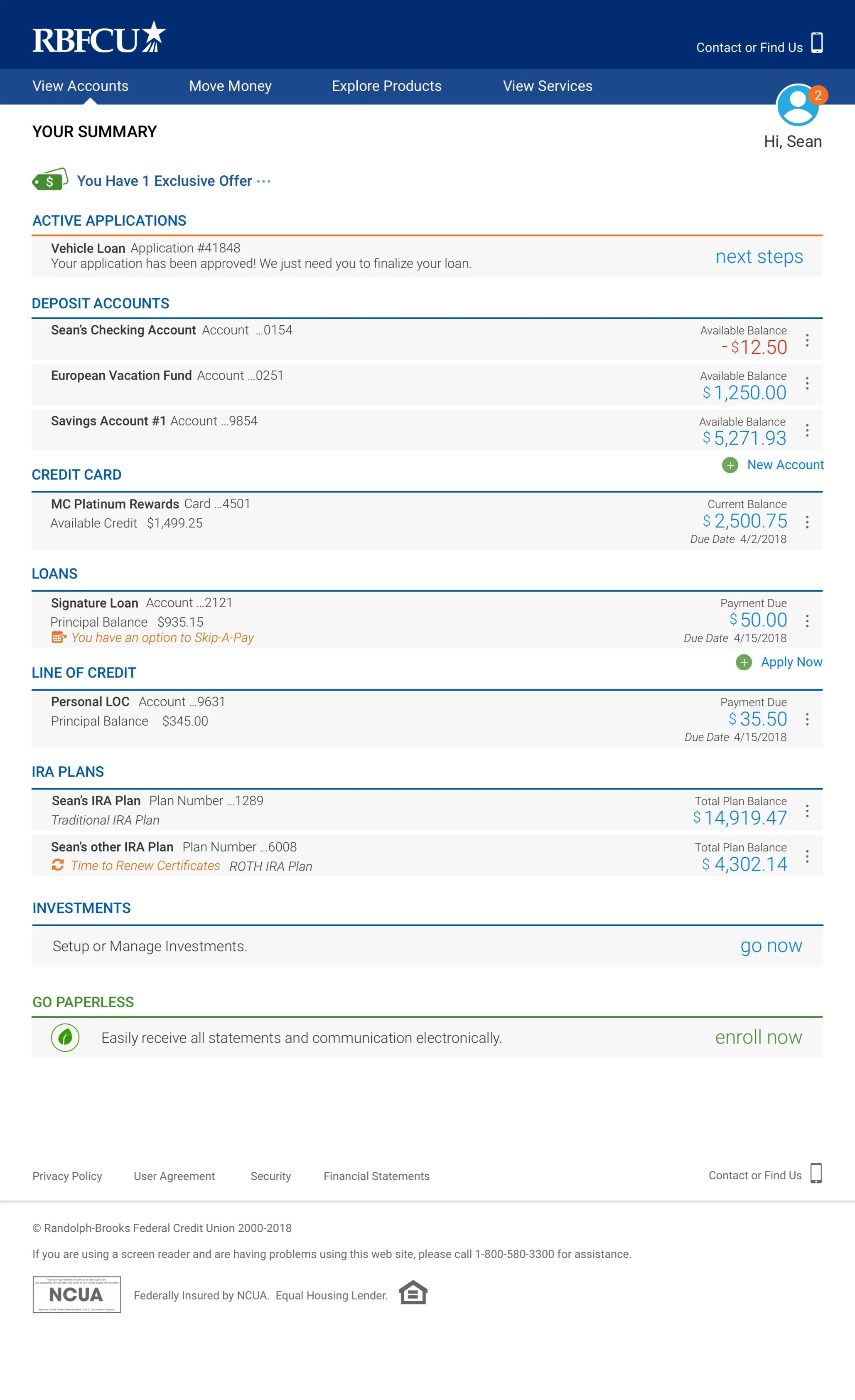
Above: This is the redesigned RBFCU Account Summary page.
Account Summary Desktop Page
A major project I was entrusted to redesign was the Account Summary page for RBFCU members. This was an antiquated piece of their identity that needed updating.
View the full InVision Prototype
Challenges
Upon joining the group, I learned there were no real UX resources in place. There were no methodologies that had been used to determine member sentiment for user experiences, nor any design libraries in place for redesigning the new site. Everything from education of UX methodologies, testing procedures, involvement of stakeholders in the design process, had to be put into place before designing one page. For the first 8 months of my tenure, I was a design team of one.
Designing a Strategy
There was a temptation by some stakeholders to jump immediately into designing a web page and focus on a quick delivery of product. There had to be a discussion of what the needs were from groups like Central Operation, Call Center, Card Services, Lending Services, Investments, Mortgage and Marketing. I partnered with a liaison from Central Operations who worked with me for 4 months. Together we interviewed key managers and team leaders from each of the aforementioned groups for their feedback. We then segued into conversations about their interactions with customers. That feedback was focused on key pain points rather than design preferences.
Thereafter we went to branch locations and asked members about use and frequency of the web site, reasons they use the web site, and their personal expectations. We also documented employee interactions when they provided assistance to members in applying for a loan online or signing up for products within the branch. My partner and I showed wireframes to members for their feedback. All this feedback was documented and we began to formulate a strategy for meeting the expectations of the member, as well as balance the needs of the business unit.
Progression of Design
There were a lot of moving parts to the RBFCU web site. As shown in the screenshot, each of the sections was owned by different departments, and each had their own requirements as we noted in our previous interviews. Partnerships with these stakeholders was imperative to help design the best solution. These business units were part of the critique sessions throughout the design process. There was a balance we had to strike between meeting the needs of the Business Units, and meeting the expectations of the member.
Discovery and Exploration
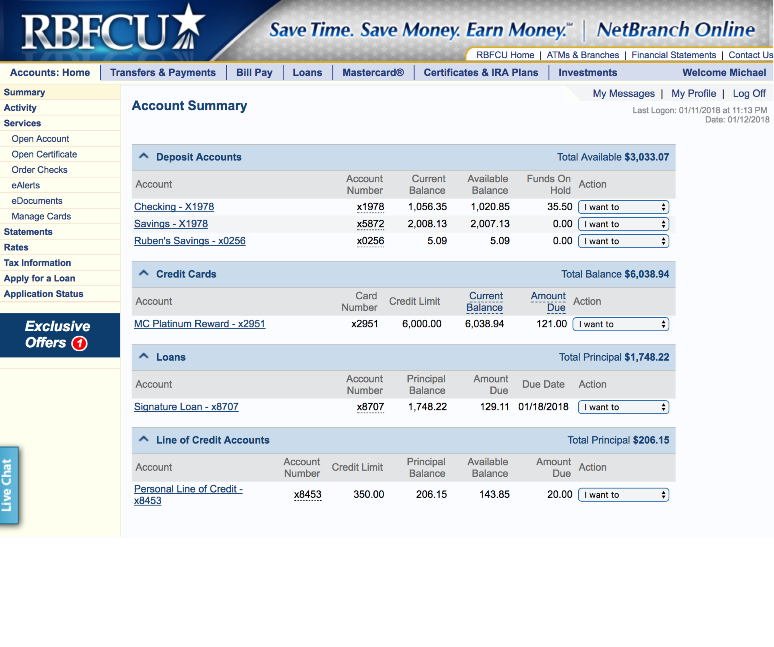
Above: This is a snapshot of the RBFCU Account Summary page before we started work. This had been the same design for over 12 years.
Above: I advocated that we needed to meet members in person and get their perspective on how they use the web site, and what their expectations are of RBFCU.
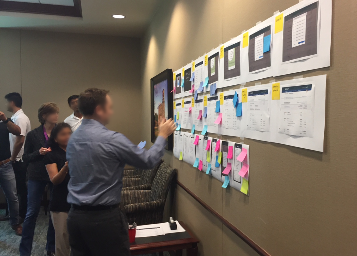
Above: Peer feedback during our critique sessions was crucial.
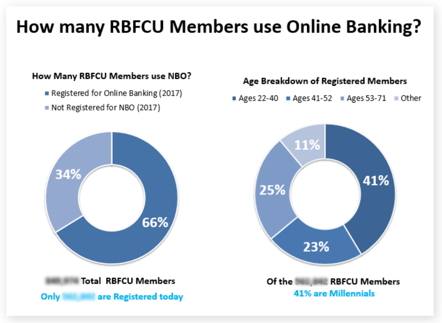
Above: Baselining who is visiting the RBFCU web site was essential. I broke down the online activity of membership by demographic. This helped communicate to stakeholders many of the design choices as we proceeded in our efforts.
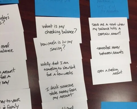
Above: When meeting our members at local branches, we asked them to participate in card sorting exercises to learn how they think and organize everyday tasks.
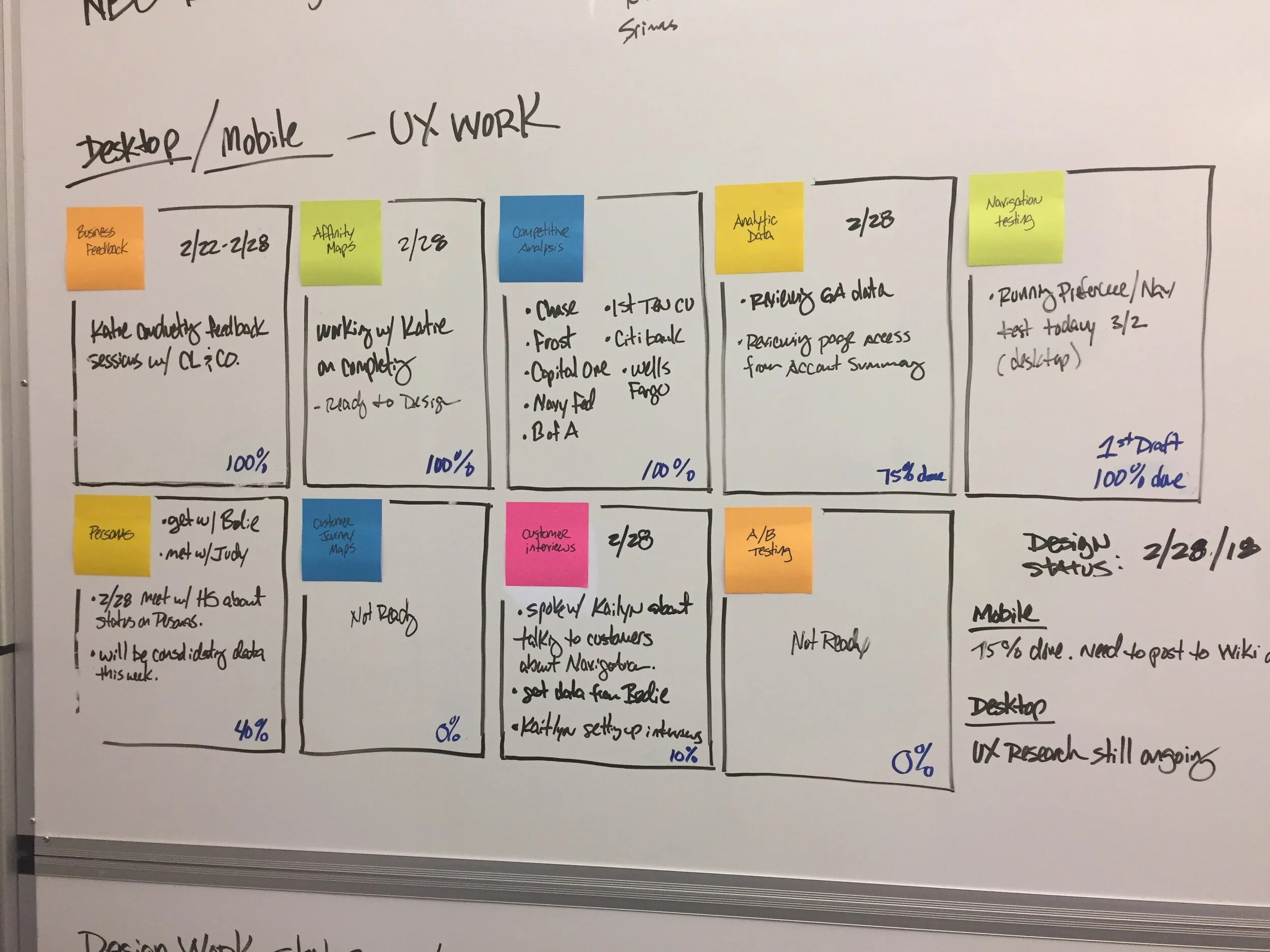
Above: A radiator board was helpful to provide insight to team members and management the status of testing, and what testing methods were being utilized.
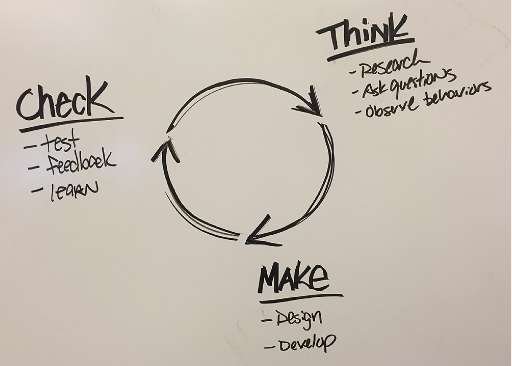
Above: I found it was a good idea to post reminders to our team as we worked. Visuals such as this wheel I drew on a marker board so Developers and QA would be reminded that we are not truly done with a design, and that change is a common practice to be embraced.
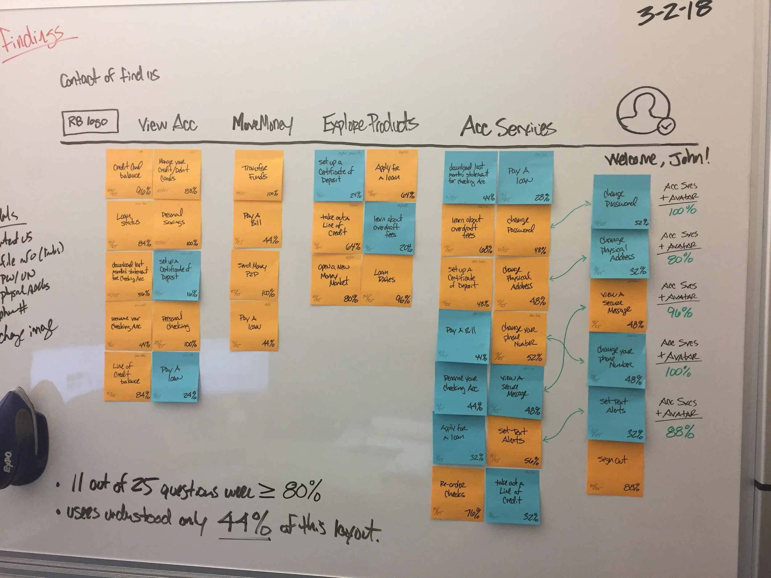
Above: We took the data from our interviews with members and created a concept of what the navigation of the online Account Summary for RBFCU should look like. We tested often using online tools as well as in person testing. The results helped us drive our decisions and provide insights for our stakeholders.